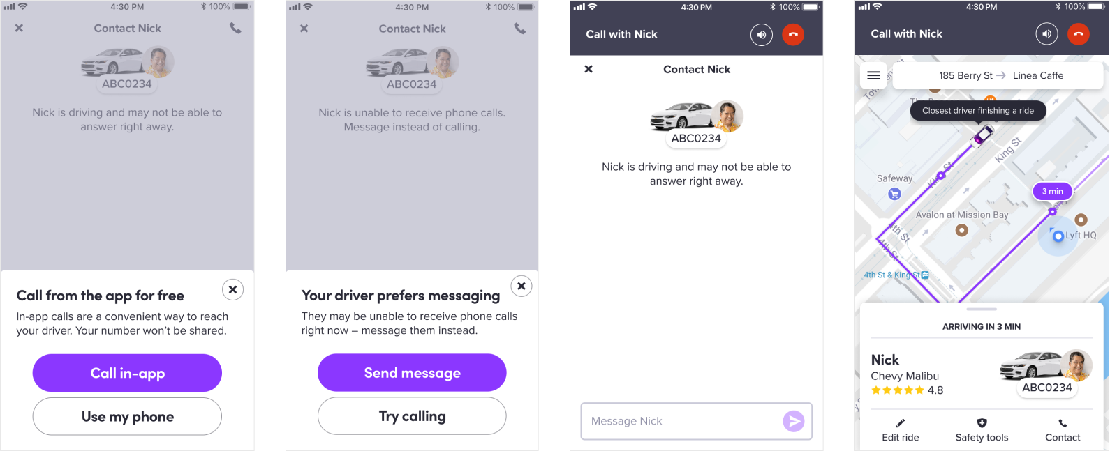
Designing in-app voice calling so riders and drivers can reach each other without missed calls, spam confusion, or exposed phone numbers.
I interned as a product designer on Lyft's Trip Experience team, which owns the core flow of taking a ride — from selecting a pickup spot to ending the trip. I led design for a new way for riders and drivers to reach each other: calling from inside the app.
Missed calls were one of the most painful parts of driver-rider communication — painful enough to be folded into Lyft's Negative Experience Score, and tied to worse long-term retention. In-app chat existed, but it wasn't the whole answer: about a quarter of text-initiated conversations ended in a phone call anyway.
How might I reduce missed calls by extending in-app communication to cover phone calls, too?
In-app calling meant building on VoIP (Voice over Internet Protocol) — the same technology behind calling in Facebook, Instagram, and Google Hangouts. Two things made it the right foundation:
I studied how other apps implement VoIP calling to understand what worked and which usability pitfalls to avoid.
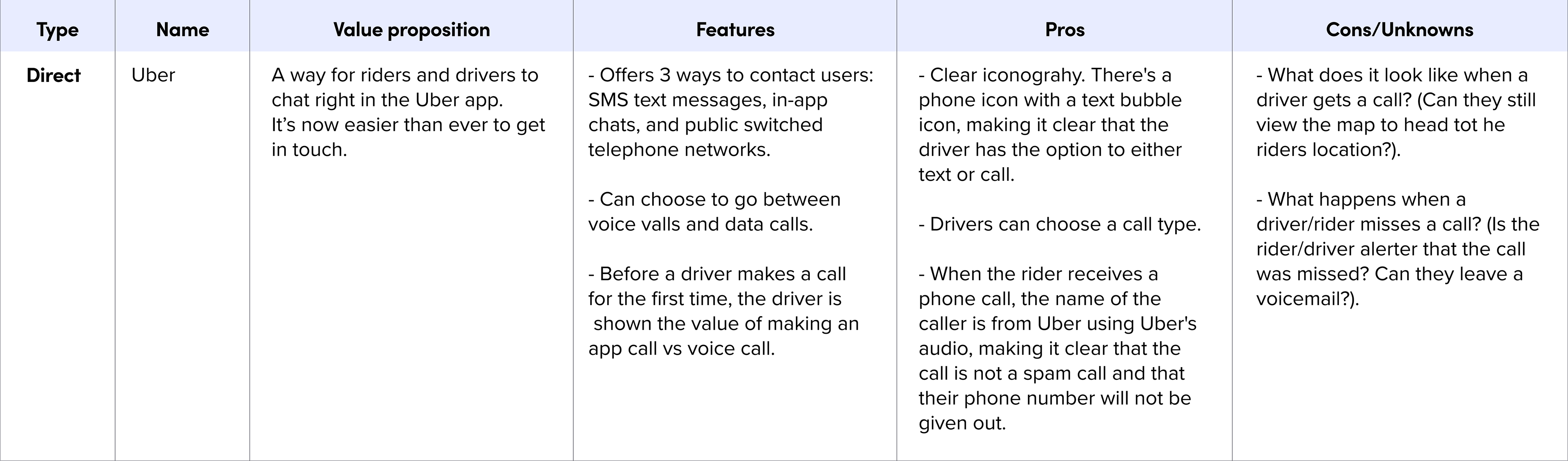
Snippet of the competitive analysis — click to expand
The clearest pattern: incoming calls take over the full screen. Unlike messages, a call demands an immediate decision — answer or ignore — so an intrusive, information-dense prompt is warranted: a number, a name, a photo if possible, each detail curated by how much it matters.
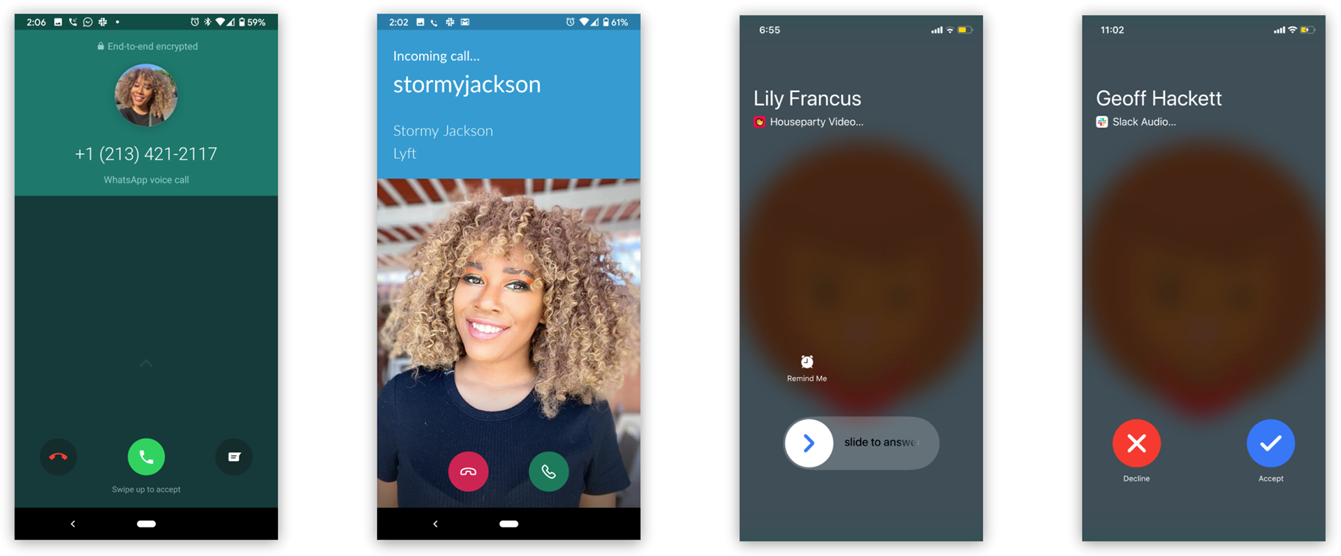
Android and iOS native VoIP calls
Since in-app calls are free for riders, I wanted to nudge them toward choosing one over a cellular call. Early copy made clear that the rider's number wouldn't be used, but didn't make clear that the call was free — a gap I needed to close before user testing.
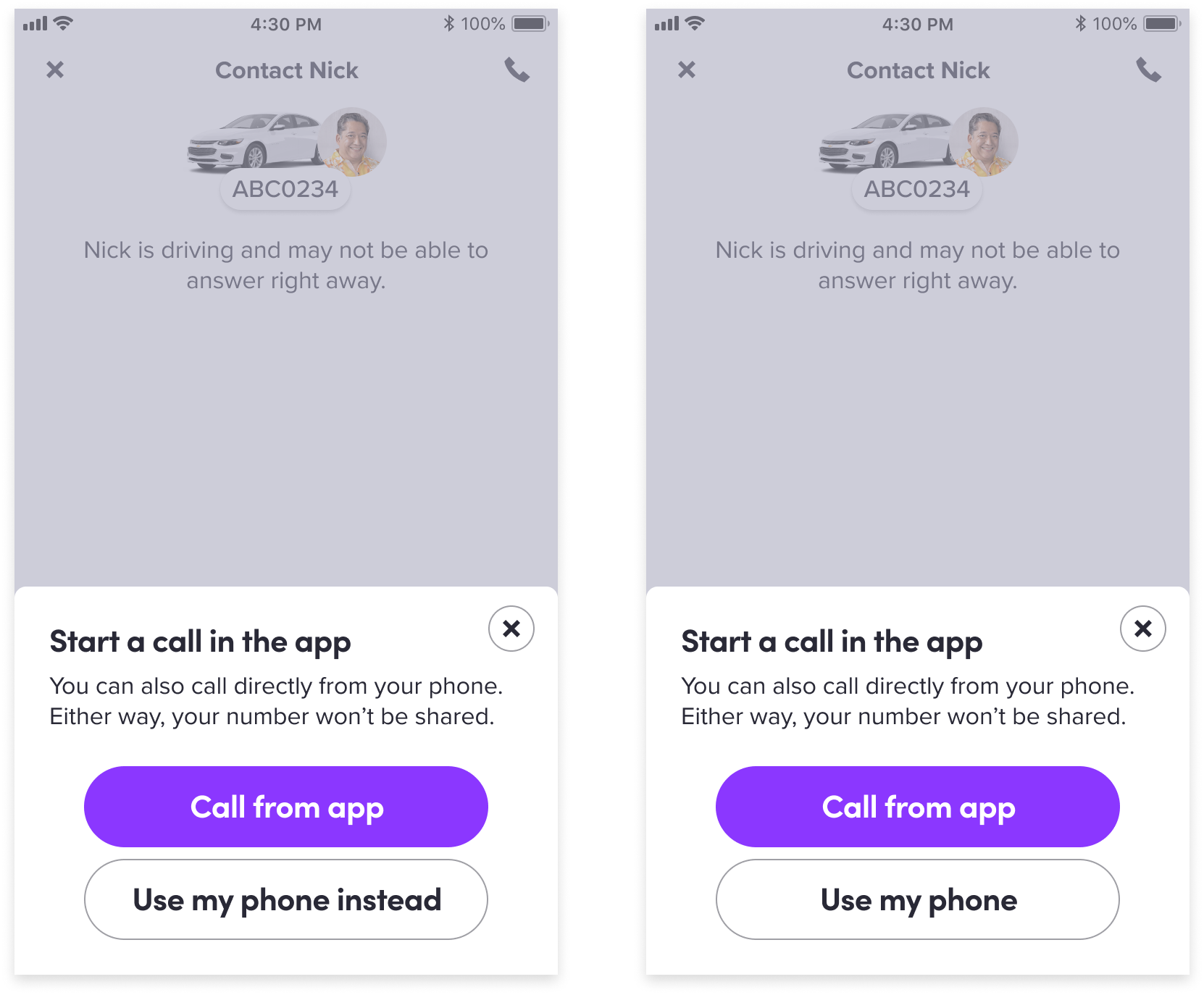
In-app prompt explorations
Phone calls aren't always the best way for a driver to communicate. For drivers who are hard of hearing, I designed a prompt encouraging riders to message instead. The copy worked — but not every driver wants to disclose that they're hard of hearing, and some riders had canceled rides after learning it. That needed a new iteration before testing.
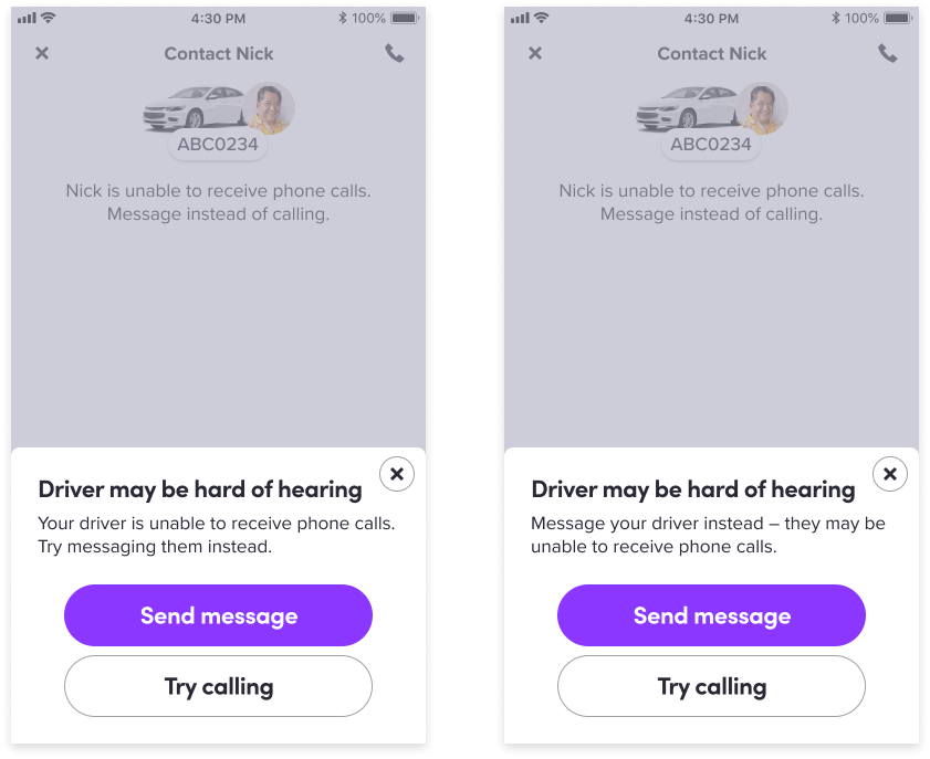
Hard of hearing prompt explorations
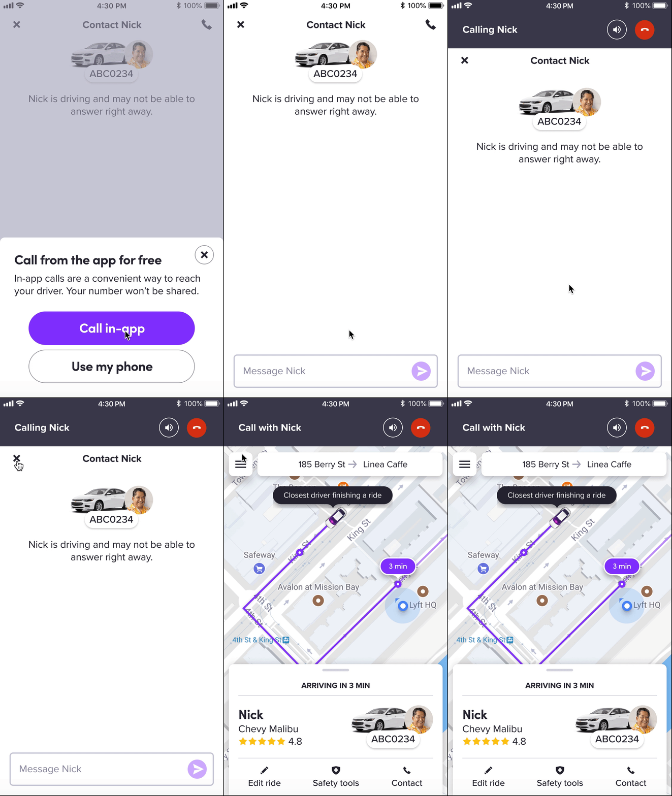
Selecting the phone icon took over the entire screen — mute, speakerphone, and end-call controls, with a transparent background so riders could still sense the chat or map underneath. The catch: a full-screen call made finding the driver's location harder. Riders had to minimize the call, return to the app, then hunt for their driver — friction I needed to design away.
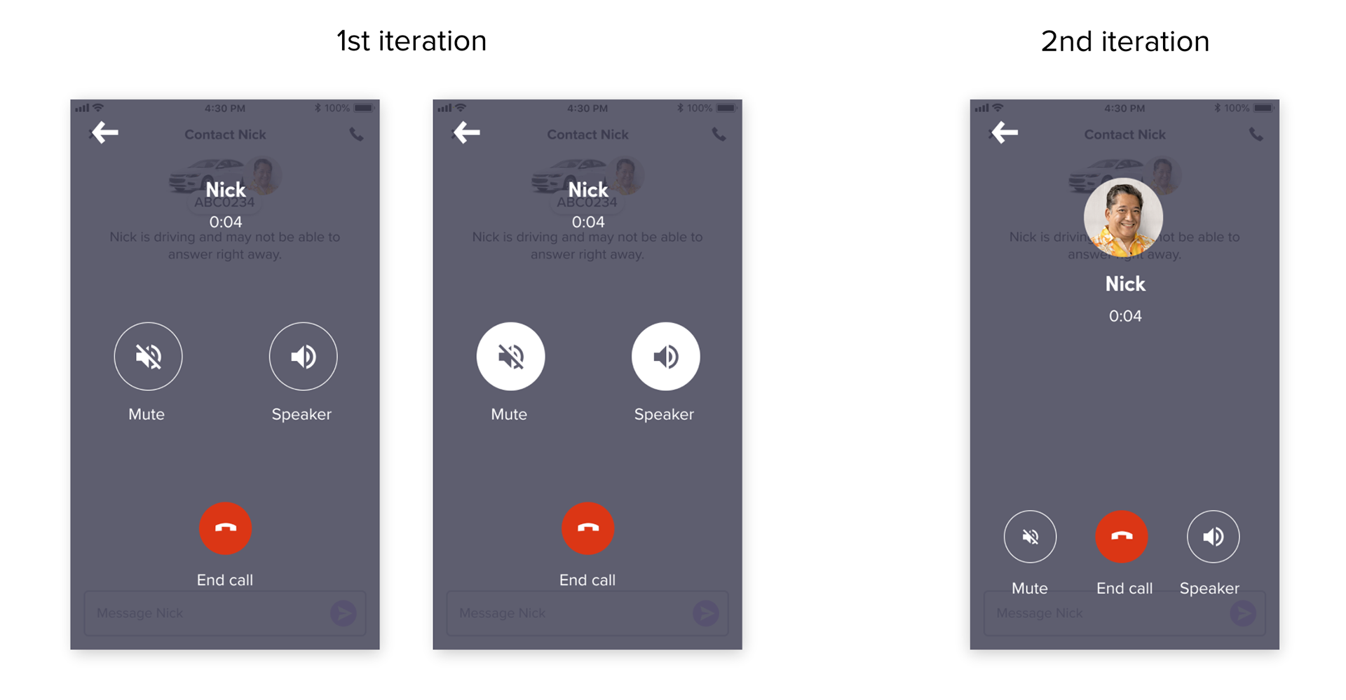
Full-screen call
To let riders multitask — checking their driver's route, editing the ride — while on a call, I explored a minimized component across four iterations. A toast vanished before users could interact with it. A banner stayed on screen but lacked an image or context, and banners are reserved for connectivity messaging, not this. Two rounds of a custom component followed, neither yet clearly signaling "you're on a call" before I landed on a version ready for testing.
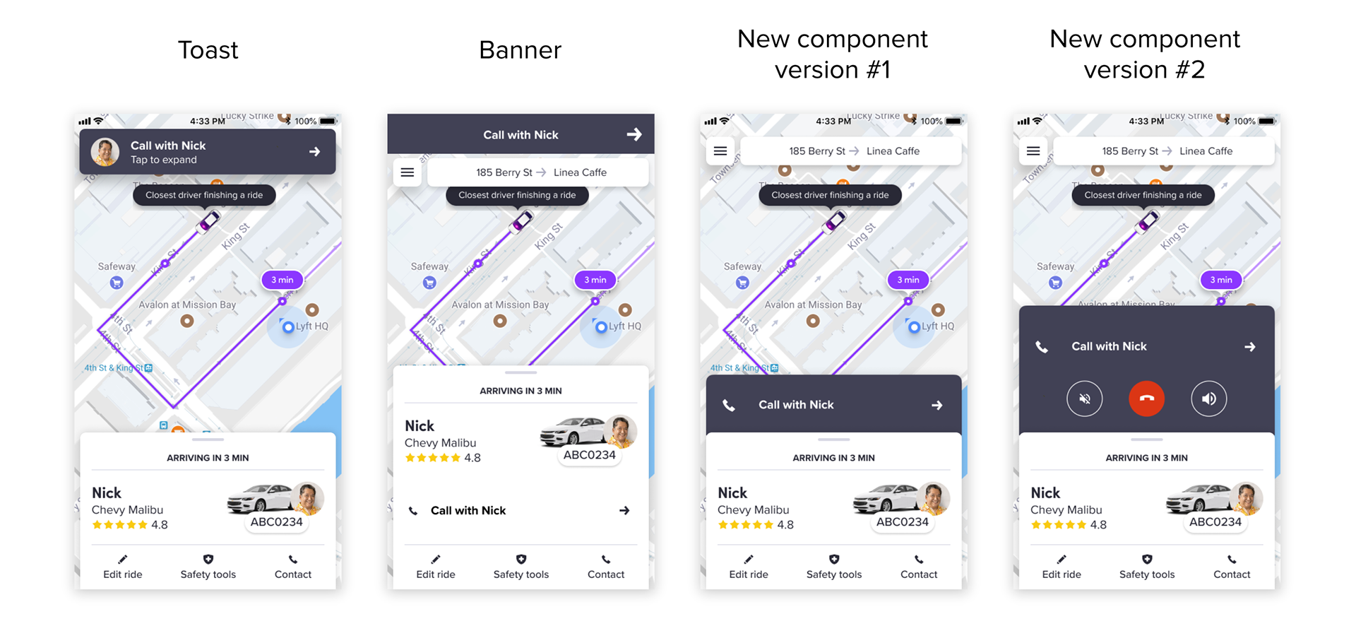
Minimized call component — iterations 1 through 4
With a UX writer, I sharpened the final prompt copy to land two value propositions clearly: the call is free, and the rider's number stays private. For drivers who are hard of hearing, "Driver may be hard of hearing" became "Driver prefers messaging" — nudging riders toward chat without disclosing a disability.

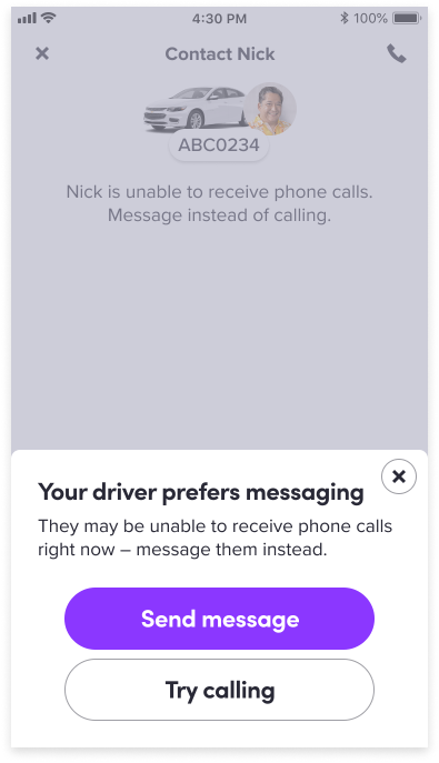
In-app call prompt · Driver prefers messaging prompt
Tapping the phone icon in chat drops down the minimized component. From there, riders can put the call on speaker or end it — and tapping the exit icon returns them to the map to check their driver's route or edit the ride.
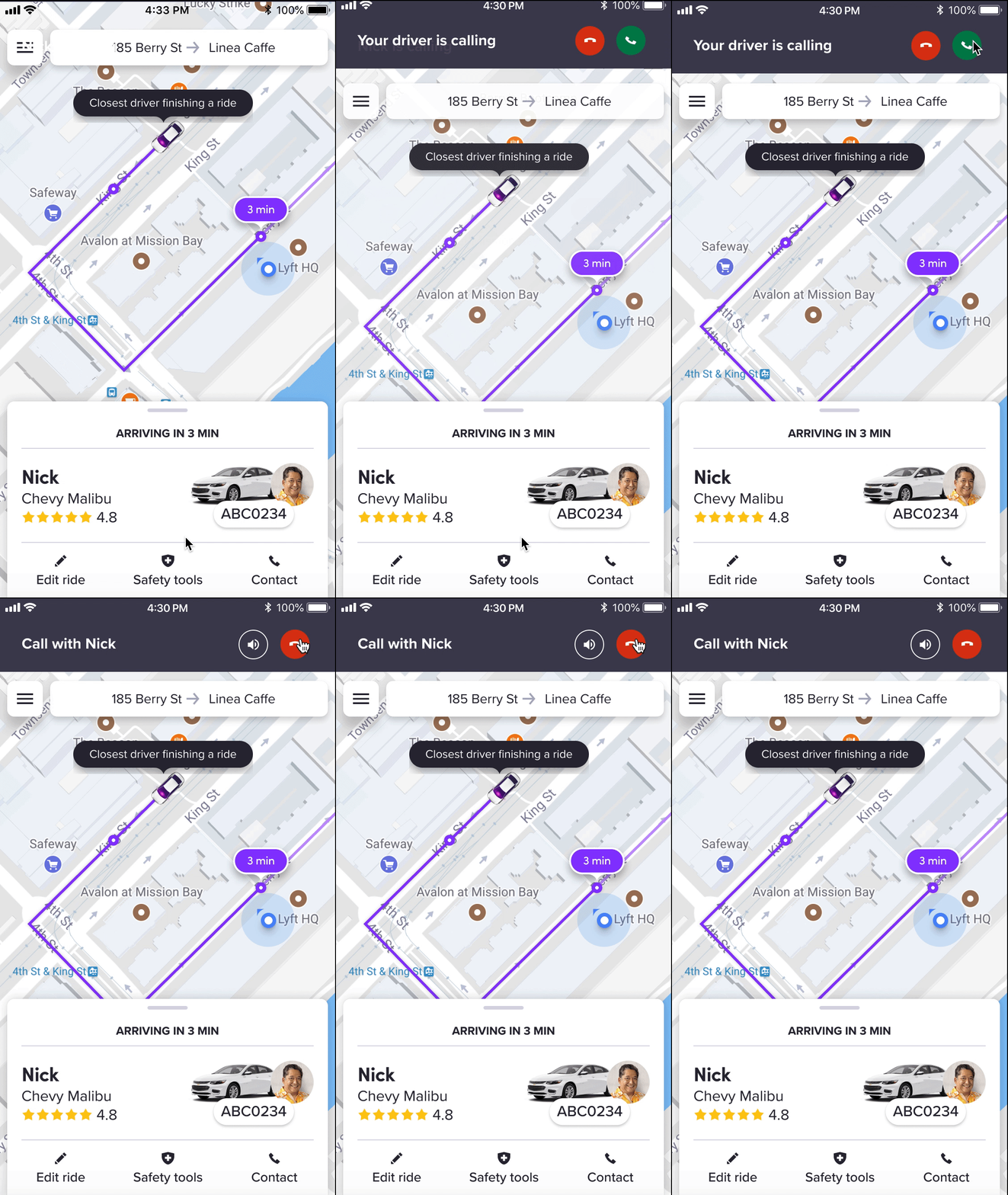
Same minimized component, mirrored: riders can answer or decline. Once answered, they get speaker, end-call, and ride-editing options — all without losing their place in the app.
Before testing, I built two versions of the incoming-call buttons — red/green and white/green — to check whether color-blind riders could tell them apart.
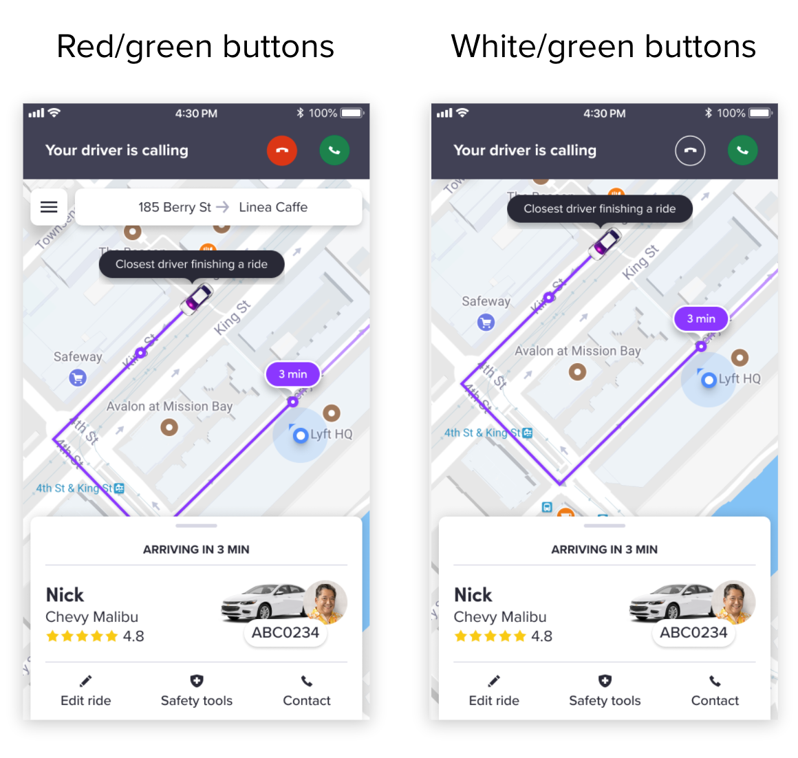
Incoming call button comparison
I partnered with a UX researcher and ran unmoderated remote tests on usertesting.com — three Figma prototypes covering the "golden path," plus an image comparison to settle the button-color question.
VALIDATED ✅ Every participant chose the in-app call.
INCONCLUSIVE 🤔 Mixed signal — users liked multitasking, but the component itself struggled.
VALIDATED ✅ All six participants preferred red/green.
Map visibility: most users weren't bothered that the map was hidden during a call, and everyone understood that the X returned them to it — though I'd still like to A/B a chat view with the map visible against one without.
Speakerphone: easy to recognize and appreciated for hands-free map viewing, though a few riders said they'd skip it in public. A useful feature, left to each rider's discretion.
Only half of testers understood the privacy benefit of an in-app call — worth solving before shipping:
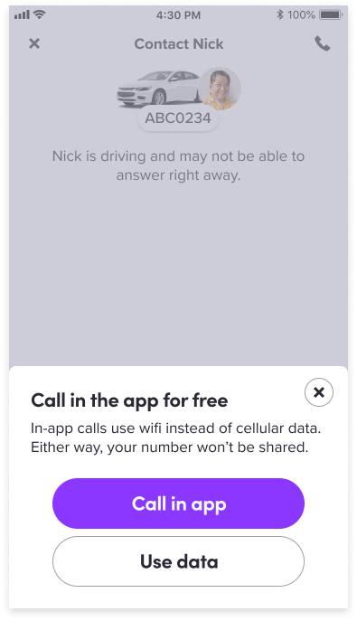
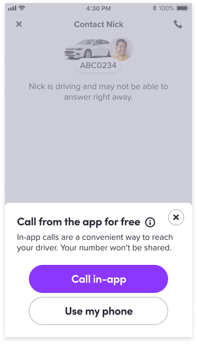
Idea 1 — rewired copy · Idea 2 — info icon
To fix the visibility problem from H2, I sketched two ways to enlarge the minimized component — one with an optional full-screen toggle, one without.
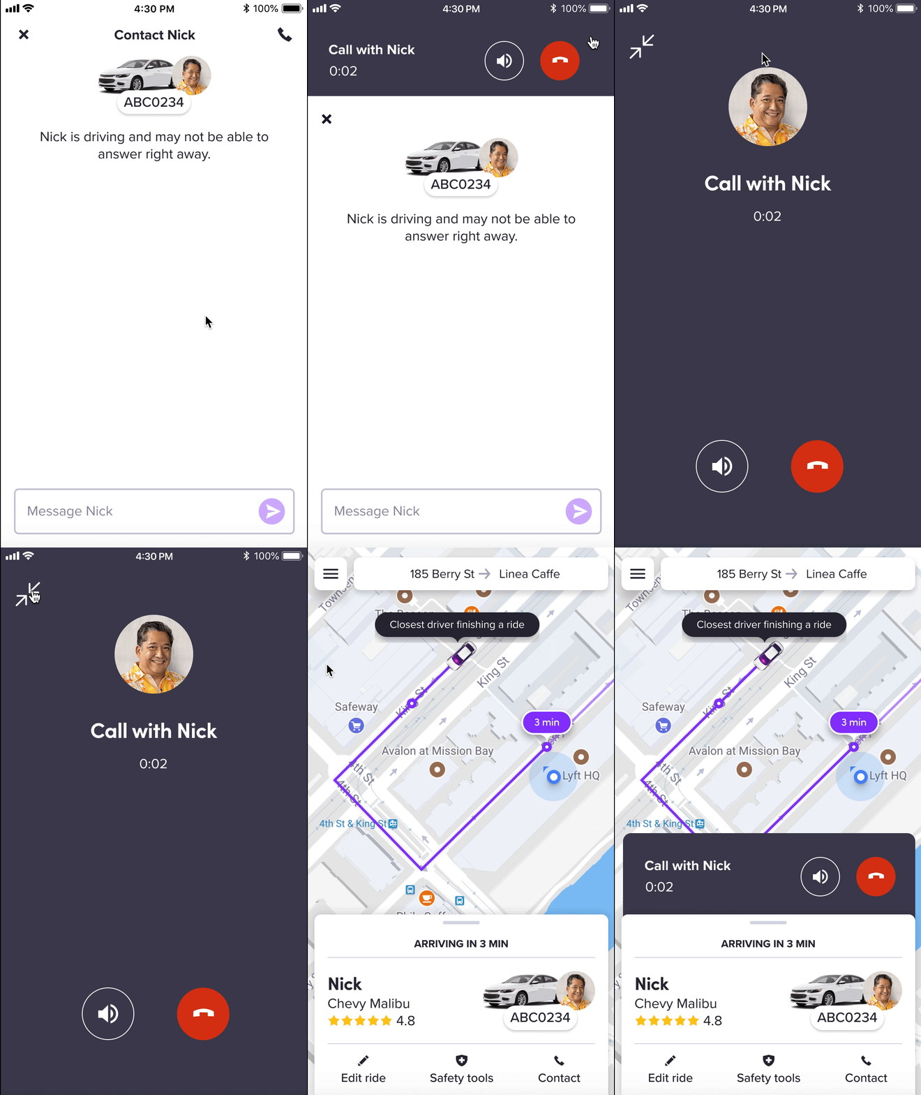
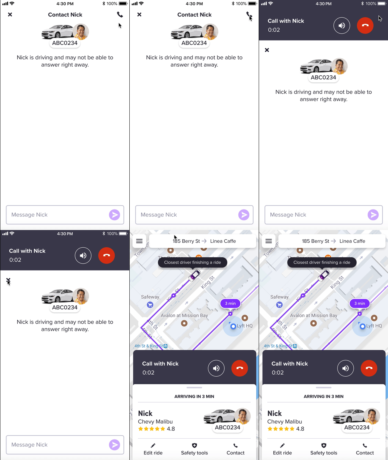
Idea 1 — enlarge with full-screen toggle · Idea 2 — enlarge, stays minimized
Same problem, mirrored for incoming calls: a full-screen call with a minimize option, or an enlarged minimized component positioned lower on screen for easier one-handed reach.
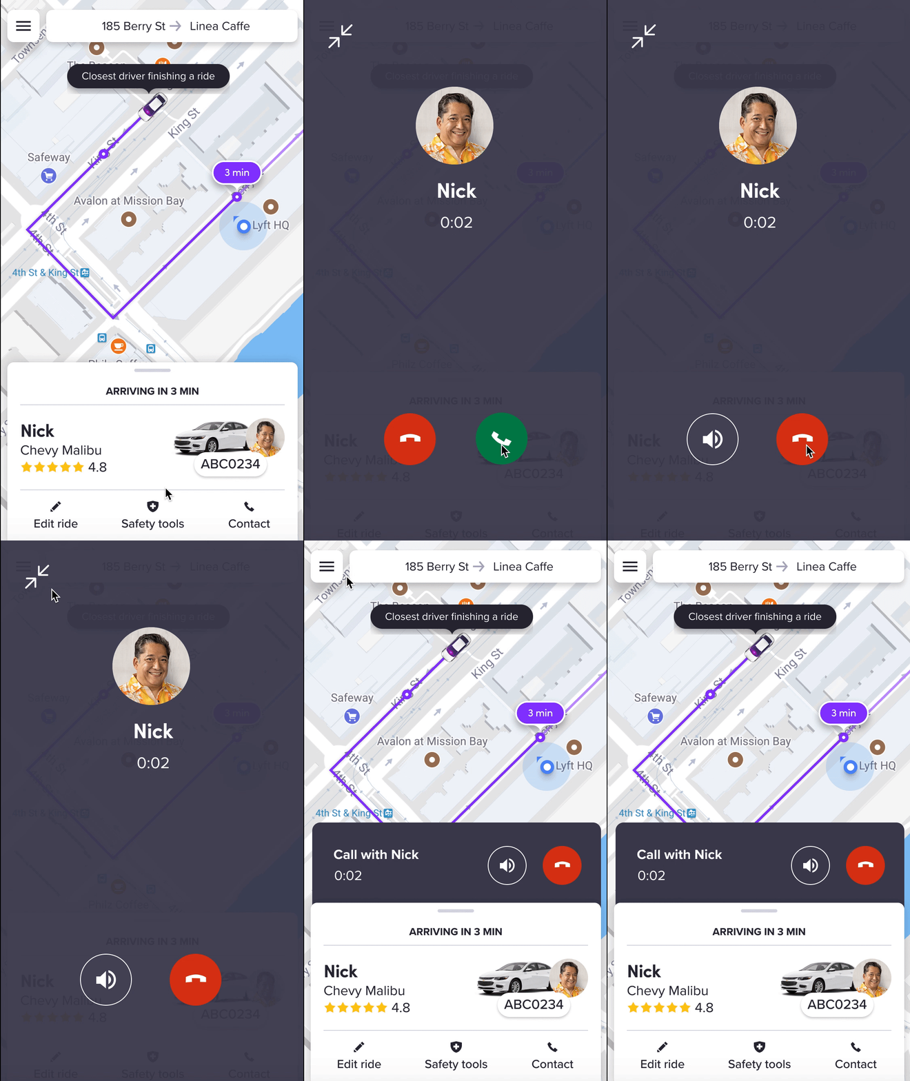
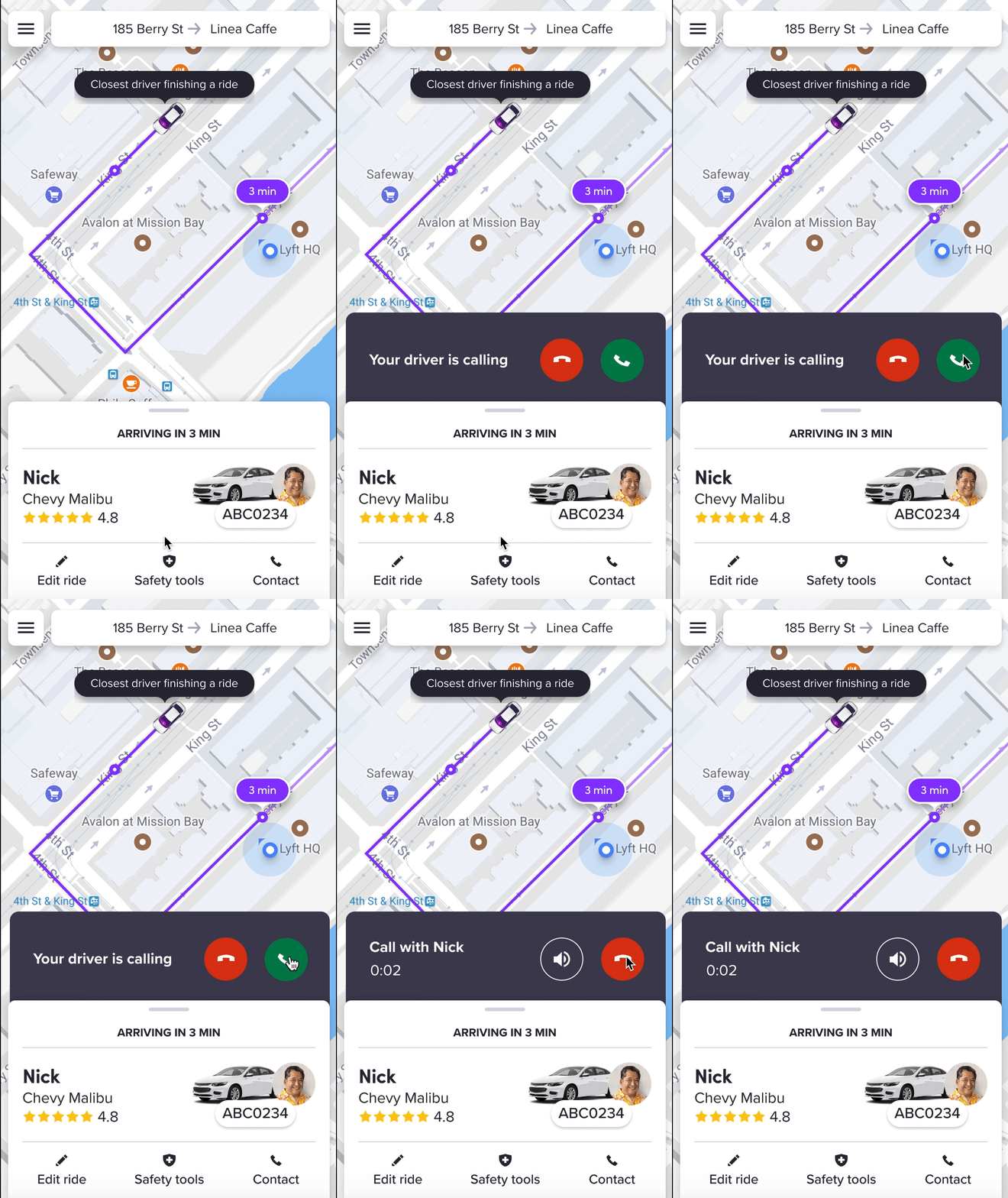
Idea 1 — full-screen with minimize · Idea 2 — enlarged, stays minimized
Not every call goes right. I mapped what the design should look like when a call ends, when a driver is unavailable, when a call fails, and when connectivity drops.
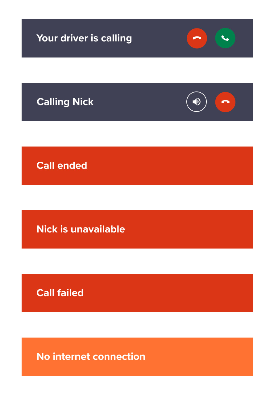
Edge cases
And the first time a rider makes an in-app call, Lyft needs microphone access — so that permission request had to be just as clear as everything else in the flow.
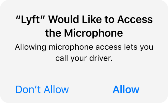
Permission access
Ask more specific questions. More than once during testing, a user's answer sparked a follow-up I wished I'd planned for. Next time, I'd map out every question I want answered before the session starts, not during it.
Run more image comparisons. I'd have liked to A/B a chat screen with the map visible against one without, to settle that open question with data instead of a hunch.
There's not really a right or wrong design process. Everyone solves problems differently — what matters is landing on something that actually works.
Compressing a normal 12-week internship into 8 made this project a crash course in prioritization. Watching how differently everyone on the team approached the same problem was the biggest lesson of the summer: process varies, but impact is the constant.