Background
Playfull is an app where users play games to win free food. There are four in-app mini-games users can choose to play as well as link their Fornite account. Every time a user plays a game, they earn tickets. These in-app tickets can be used to purchase exclusive restaurant deals which Playfull calls “rewards”. These deals help keep users retained on the app as well as drive traffic to Playfull’s restaurant partners, increasing their sales.
Problem
The rewards page overwhelms users with information. When conducting user interviews, 40% of users brought up that the rewards page felt too busy, making them feel overwhelmed with information. Users also had difficulty with searching for a specific reward/restaurant when asked.
The rewards screen is the first screen that users land on once they open the app. It’s a page made for searching restaurants near them as well as purchasing rewards with in-app tickets for redemption at restaurants. With Playfull’s main goal to drive traffic into their partner restaurants and increase their revenue, it’s important for the rewards screen to be easy to navigate.
Goal
Redesign the rewards screen so that users are easily able to navigate their way to find a restaurant and reward. Doing so should decrease the time spent on the rewards page and increase reward redemptions.
Role
During this time, I was the lead and only designer on the team of 15.
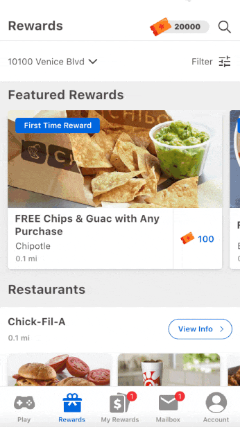
Existing Rewards Page Explained
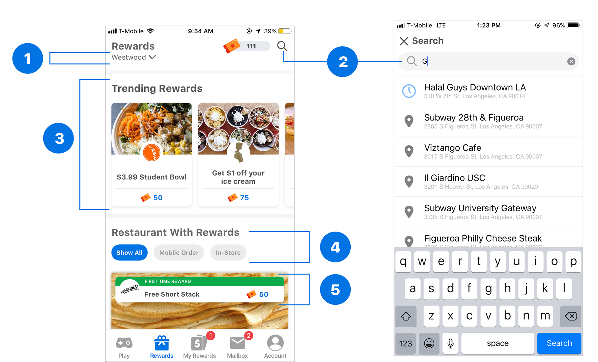
1. Location
Users can find restaurants near the location they set.
2. Search
Users can search for restaurants nearby.
3. Trending rewards
These are rewards that are popular around a user’s location. They’re used to help users make quicker decisions on what items to order.
4. Restaurant Filters
There are two types of restaurants a user can filter between mobile order and in-store.
1. Mobile order restaurants are restaurants where users can place orders online and pick up the order in person.
2. In-store restaurants are restaurants where users have to both place orders and pick up in person.
5. First Time User Rewards (FTURs)
First Time User Rewards are special rewards that users can only use at a restaurant once. Playfull’s goal has been to get users to use FTURs when they go to a restaurant for the first time because the data shows that once a user redeems one, they are 12% more likely to convert into a regular customer, visiting at least twice a month.
Problems with Existing Layout
1. Relationship between Restaurants Search & Filter
When asking users to filter restaurants by mobile order or in-store, users expressed that they expected the filter to be grouped with the search and location features at the top of the screen.
2. Information Hierarchy
Playfull’s goal is to have users redeem First Time User Rewards (FTURs) first, but according to existing data, the most common rewards actually used are the trending rewards.
My hypothesis during the redesign was that this is because of the current information hierarchy in place:
• In terms of visual hierarchy, the trending rewards are the largest and most noticeable rewards (at the top of the page).
• Conversely, the FTURs are a lot smaller and lower on the screen. This gives users the impression that trending rewards are more important to use than a FTUR.
3. Limited search features
During our user interviews, 80% of users explained that they tended to order from the same restaurant and use the same rewards. This highlighted a major problem with our search functionality:
• Because the current version of the search feature didn’t have a quick way to access the same restaurant or purchase the same reward, users have to re-enter the name of a restaurant and re-search for the reward each time they wanted to make an order.
• This unnecessarily takes up time and upsets users, lowering their desire to re-use PlayFull’s ordering service.
4. Unclear Search Results
When entering G in the search bar, I didn’t get a clear understanding of how the search bar worked. I got some restaurant results that had a G in the middle of a restaurant’s name as well as results that didn’t even contain a G.
5. Unappetizing Food Images
With Playfull being a food ordering app, the images of food should look appealing in order to attract users to continue. However, most of the screenshots of food on the page are too zoomed in to even distinguish what it is.
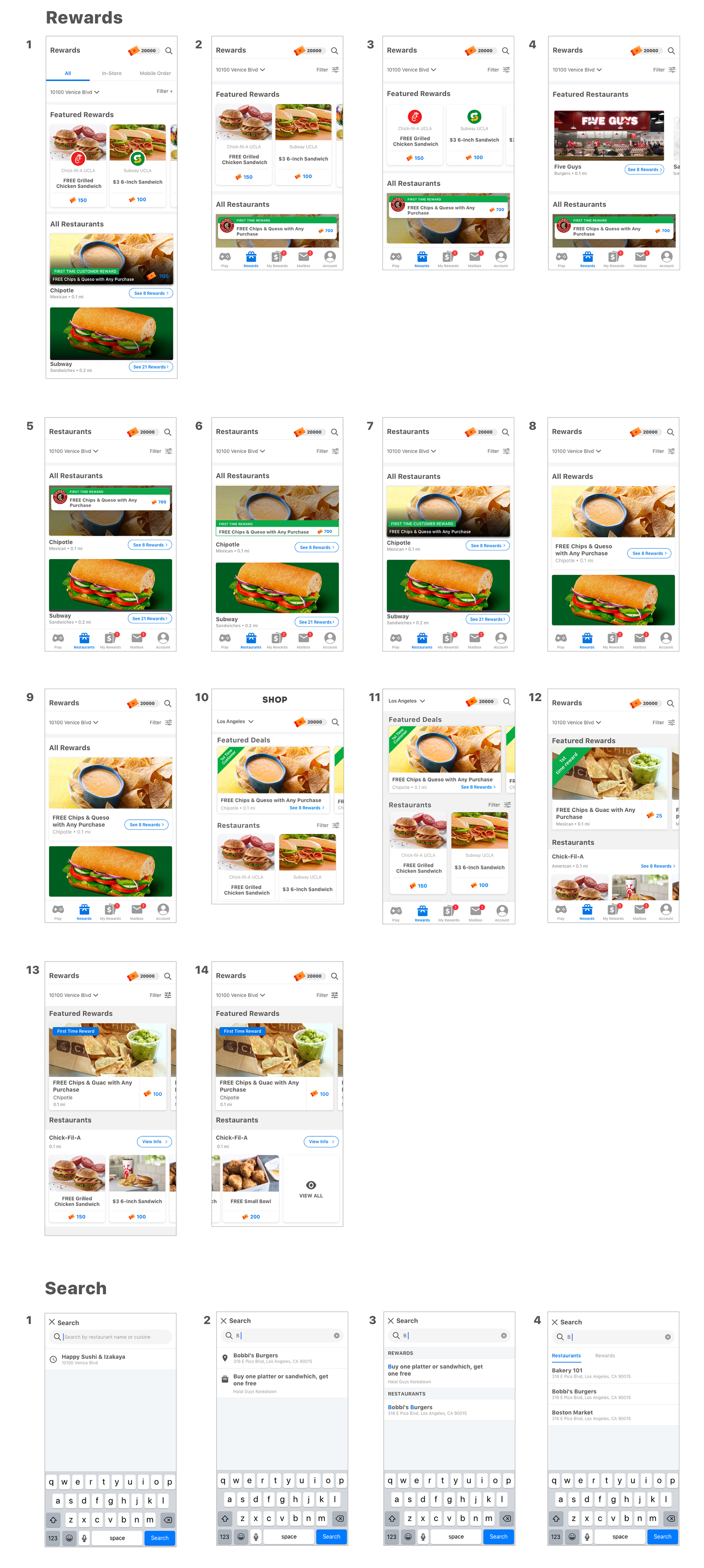
Redesigning Playfull Rewards
Planning the Experience
After analyzing all of the problems with the existing rewards page layout, I worked with the product manager on the team to develop a concrete set of feature requirements to improve the user experience and improve.
Rewards Page Requirements:
• New users can easily find, purchase, and redeem a reward.
• Users can easily find a specific restaurant they’re looking for.
• Users can easily find a specific reward they’re looking for.
• Users can easily discover a reward/restaurant that interests them (sorting, filtering, etc.).
• Certain rewards are well-advertised to the user (first time, “featured”, etc.).
Live Search Results:
• Search requirements
• Users can easily find a specific restaurant they’re looking for.
• Users can easily find a specific reward they’re looking for.
• Users can easily discover a reward/restaurant that interests them (sorting, filtering, etc.).
• From there, I created multiple iterations of the rewards page to address these issues and meet the spec requirements.
From there, I created multiple iterations of the rewards page to address these issues and meet the spec requirements:
Final Design Changes
After talking to the team about my thoughts about the different iterations of the rewards and search screens that I designed, I came to a final design decision based off what iteration best addressed the user needs and fit Playfull’s business goals.
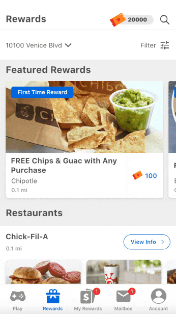
Rewards page
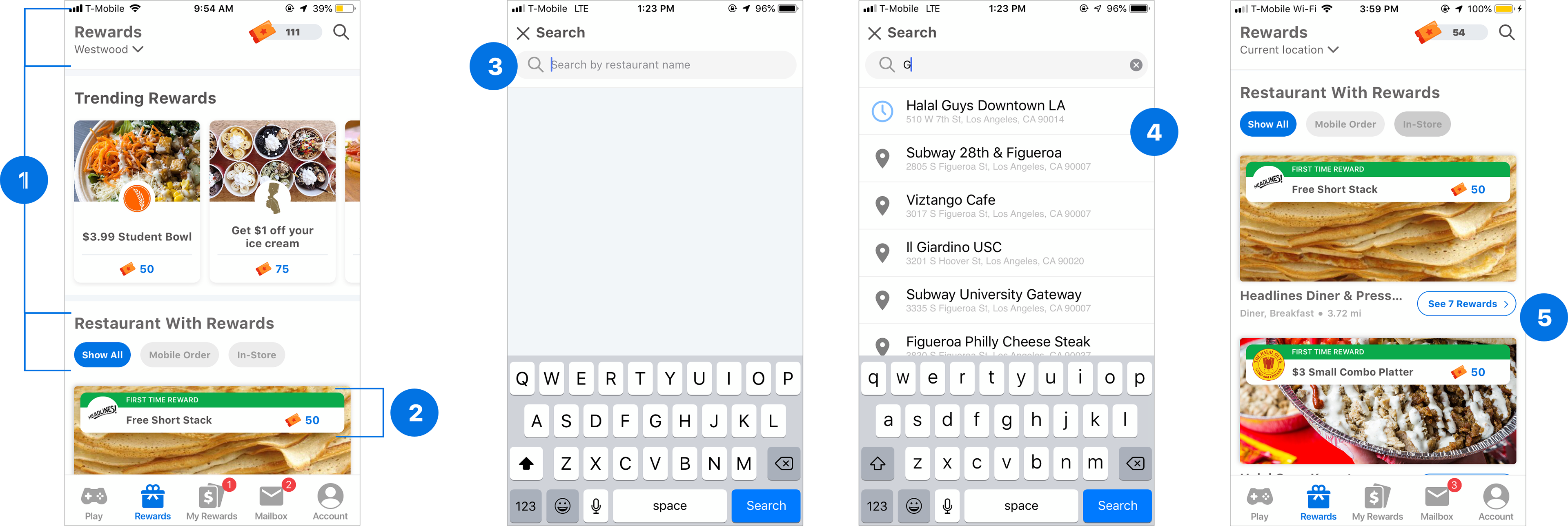
Filter
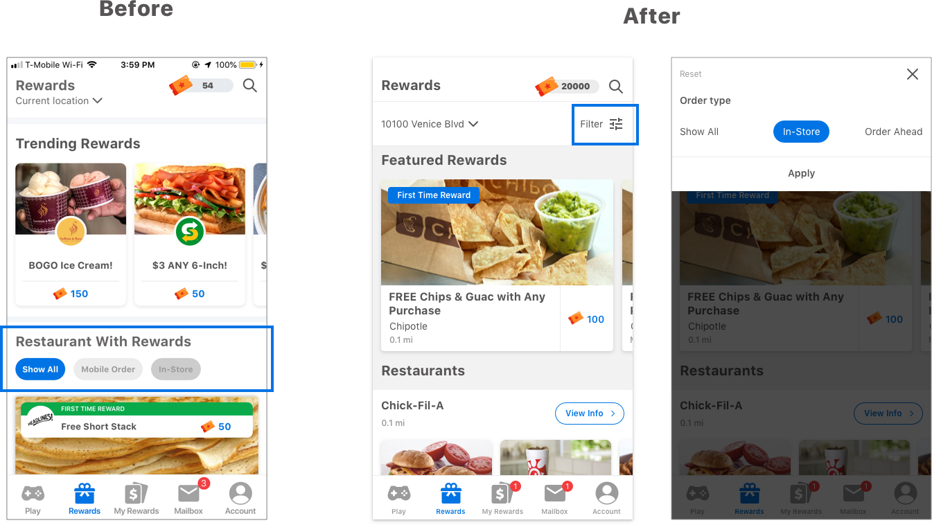
Based on the comments from user testing, in the redesign, the filters section (for In-Store/Mobile) is visually grouped with location and text-based search, making it easier to find.
Filter Animated Prototype
Trending/Featured Rewards
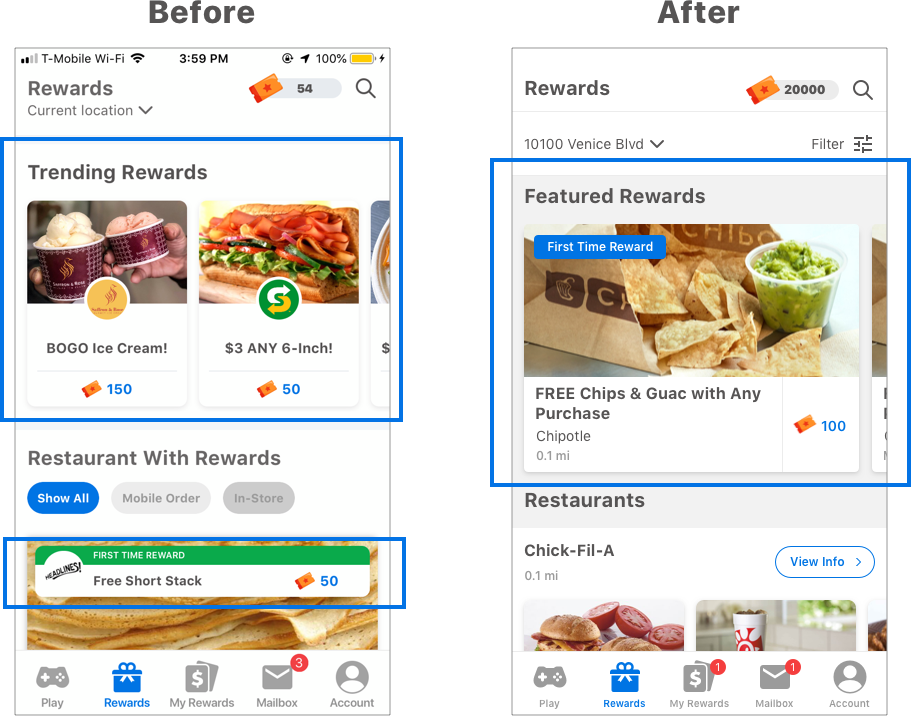
To fix the information hierarchy, the redesign changes multiple aspects of the top-most section (the existing Trending Rewards section):
• Instead of only showcasing popular rewards (trending), the section includes a mix of First Time User Rewards (FTURs) and Trending Rewards.
• To account for this changed behavior, I changed the name of the section from “Trending Rewards” to “Featured Rewards”.
This helps emphasize the FTURs over the existing layout, giving them at least equal emphasis as just general popular rewards to users. To further differentiate FTURs to reinforce their significance and drive conversions, the redesign also adds a “First Time Reward” tag for FTURs (as shown in the mockup above).
General Restaurant Rewards
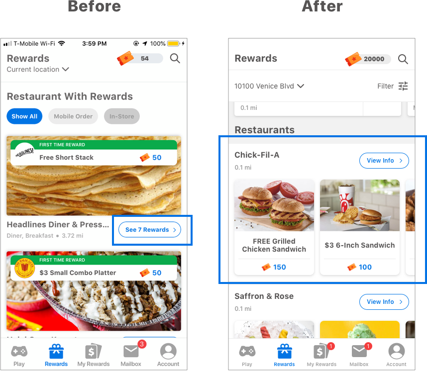
To help drive reward conversion, the redesign showcases rewards available at each restaurant in the “Restaurants” section of the Rewards layout, rather than information about the restaurant (which is usually conveyed in the picture and upon clicking). Based on user feedback, this should help users decide not only on which rewards to redeem, but also inform decisions on which restaurant to select (based on the savings potential of the reward).
Rewards Animated Prototype
Search
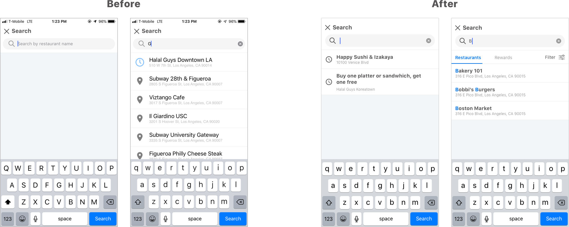
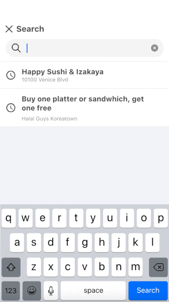
Search History
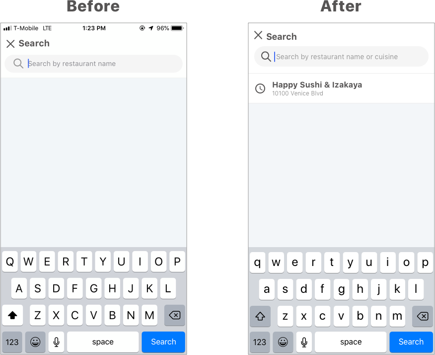
To assist users with quickly re-ordering from the same restaurants or re-using the same rewards, the redesign includes a sticky “search history” for both location & restaurant name search.
• When the user selects the search icon, before entering any search string their most recent restaurant and reward oooosearches (that they actually used) will be displayed, which substantially reduces conversion friction & improves ooooretention.
Restaurant/Reward Search
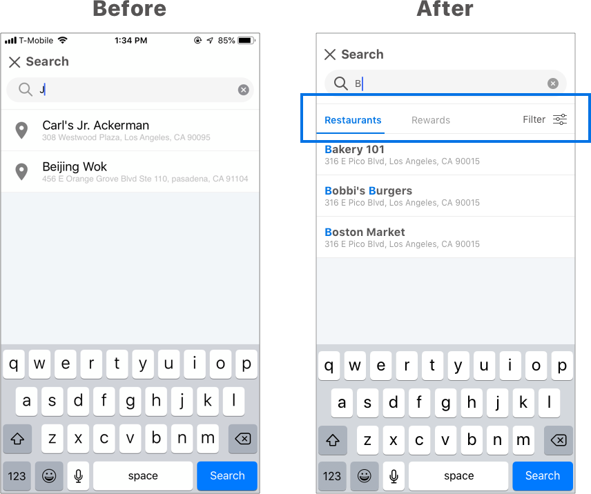
When a user enters a character, a tabbed section under the search box gives users the option to switch between searching (by substring) for restaurants and rewards. To further enhance search capability, users can also filter their search results between Mobile and In-Store pickup.
Highlighted Substring in Search Results
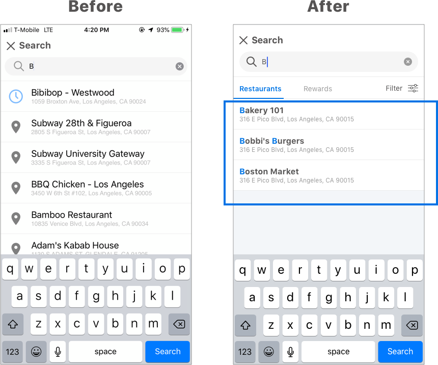
To clarify how search actually works by substring (e.g. what part of the result is matched), the redesign adds character highlights. Every matching character/word now appears highlighted in each search result.
Search Animated Prototype
Testing the Redesign
After finalizing the designs, I created a prototype and conducted user testing. When asking participants to search for a specific reward and filter restaurants by mobile-order, all participants were able to easily do so versus only 60% of participants with the previous version. In addition, I asked participants to give their first impressions about the rewards page, they expressed that it felt clean and easy to digest.
Tracking Metrics
To determine if the new changes to the rewards page is successful, I wrote out a list of metrics to compare with the current rewards page. I then spoke with the product manager on the team on using Amplitude to continuously track the data.
Task completion time
• The time it takes for users to find a restaurant/reward.
Engagement
• How often users access restaurants/rewards through the search history function.
• How often users redeem First Time User Rewards vs. general rewards.
Conversion
• Measuring the data against the total of DAU/MAUs and the percentage of users who redeem rewards.
Conclusion
Unfortunately, the feature wasn’t able to be shipped. Playfull decided to switch their business strategy and with that, they changed from being a mobile app to a desktop website that no longer partnered with restaurants.
What I Would Do Differently
When doing user interviews, I learned that 40% of users tend to order the same food from the same restaurant. Knowing this, I would like to include a favorites section on the rewards page. The way it would work is that users can favorite items or restaurants and they would be pinned at the top of the page for easy access. It would save time from having to relocate a specific restaurant or reward, getting users to order food from a restaurant even faster.