Final deliverables
Overview
Tala is an Android app that provides people in emerging markets with immediate access to credit, quick loans, and a full financial account. They currently serve customers in the Philippines, Kenya, Mexico, and India.
The way Tala works is a user will apply for a loan on the app. If approved, they have immediate access to funds as well as other features like a checking account and bill pay.
For this project, I lead the design of Tala Rewards, an in-app loyalty program that incentivizes and rewards borrowers for engaging in positive financial behaviors.
The team
I was the sole designer of the project and I worked alongside a product manager, researcher, product marketing manager, engineers, graphic designers and a systems designer.
Challenges
The feature launched in a country I’m not familiar with. The feature launched in the Philippines and I’m not familiar with the language or culture. I relied on the help from a researcher based in the Philippines. She helped me get the information I needed for a competitive analysis as well as interview users that spoke Tagalog.
Developer constraints. While working on this feature, I was made aware that the developers for this project were at capacity with their workload. I had to keep in mind to make this experience less robust.
Lack of a finished design system. While working on this feature, there wasn’t a design system in place. I had to make my best judgment on how to design the feature based on previous inconsistent designs while I contributed and waited for the design system to be finished.
Problem
Tala lost a significant amount of users to its competitors who offer higher total value. The competitors offered:
• Lower transfer fees / higher loan utility.
• Rewards, loyalty, and referral programs
• Reduced friction (easier access to $)
Additionally, we have seen that users who engage with multiple product features in the app such as opening and transacting within an account leads to significantly greater repayment rates and customer retention. This makes multi-product user volume and engagement critical.
Testing the water
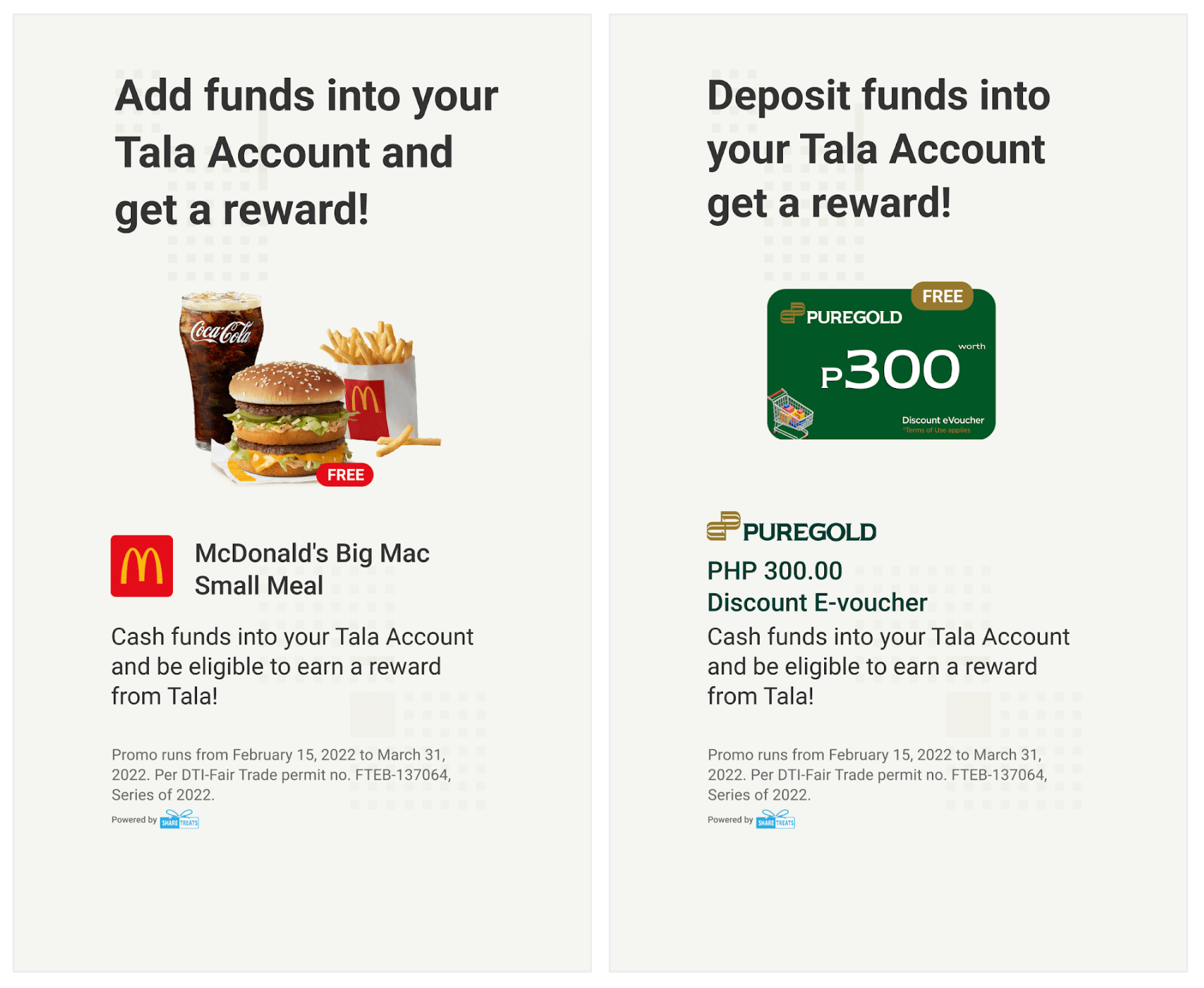
I partnered with the product manager and researcher on the team to test the idea of incentivizing multi-feature engagement by offering users rewards for depositing money into their Tala account. The user testing results showed a 30% increase in account deposits.
With the positive results, the team decided to focus their efforts on developing a robust rewards program.
Previous designs tested
Tala’s big bet
By encouraging multi-product engagement through incentivized/rewarded actions within accounts and lending, we can drive higher LTV via stronger repayment rates and better retention.
What is success
• Increase early customer retention by 5-10%
• 5-10% decrease in loan default rates
• 5-10% increase in new Tala account deposits within 30 days
Project kickoff
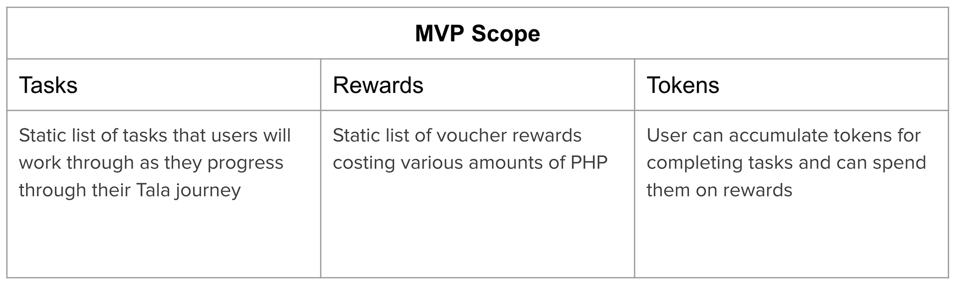
The team had a kickoff meeting for the project where the product manager let me know the scope of the MVP:
Research
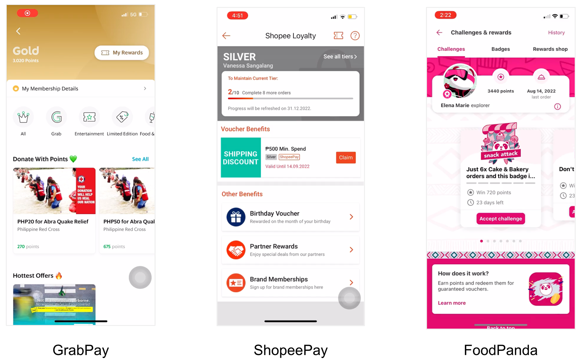
I conducted a competitive analysis of loyalty program apps in the Philippines. I spent time determining what features I may want to adopt for Tala Reward in addition to usability issues that I should avoid.
Common themes with loyalty reward apps in the US and Philippines:
• There's a prominent section on the screen detailing the status or total points that a user has.
• There are both rewards that take a shorter amount of time and less effort to redeem as well as rewards that take a longer amount of time and greater effort to redeem.
• There's a variety of rewards to choose from so that the user doesn't get bored with their options.
• There's a guide to explain to users what actions they need to take in order to unlock a new reward.
User flow
I created a user flow of what the experience will be when navigating through the rewards feature:

Once the user flow was looked over and approved by the product manager, engineer and design team, I started creating the designs.
Design explorations
Rewards home page
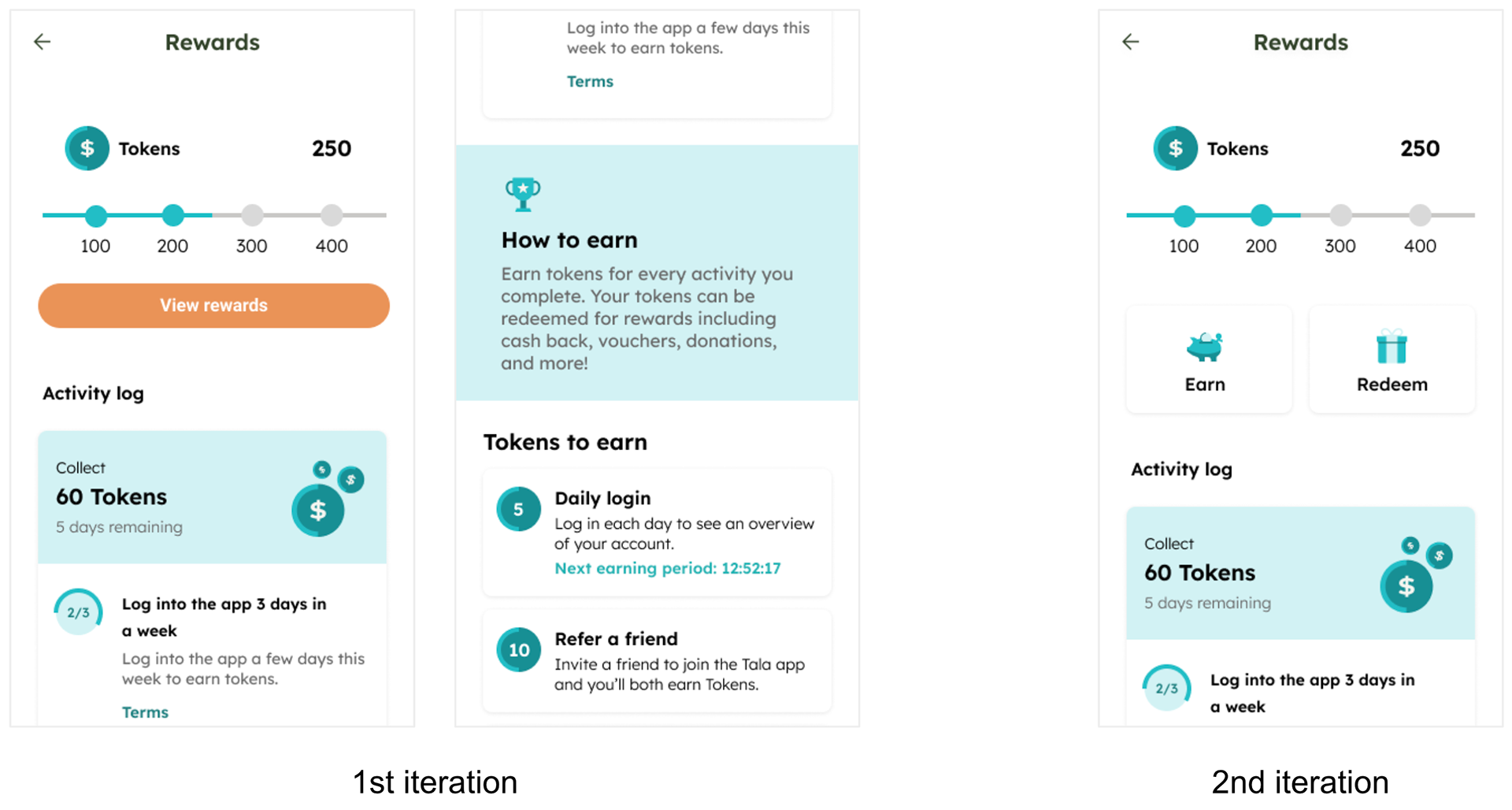
Oh the top of the page of the first iteration is the token amount and the token process bar. The “view rewards” button has the rewards available nested. There is an activity log which displays special activities that the user can complete to earn additional rewards. Following that, there is an informative “How to earn” section as well as a list of activities that a user can complete to earn tokens.
For the second iteration. I nested the rewards and activities behind the earn and redeem buttons so that the page didn’t feel overwhelming.
Reward options/details/redemption

For this iteration, I separated the rewards that are available by token milestone. If the user doesn’t have enough tokens, the redeem rewards button will change to a grayed out button instructing the user that they need more tokens to redeem. When the user taps on the rewards card, it will bring them to a new page which will show the details about the terms and conditions of the reward. Once the user redeems the reward, they will receive a confirmation saying that the reward has been redeemed and instructions on how to redeem in person.
Problems with these reward home designs
After creating these first two iterations, I realized that there are some issues that I needed to address before I send out the designs for user testing.
Problems with the reward home screens:
Issues with hierarchy of information. I realized when looking at the screen, it’s hard to tell where exactly the eye should focus on first.
Nested rewards. While thinking about the hierarchy of information issues, I realized it might be more valuable for users to be able to see the possible rewards that they can earn first to get them interested in completing the activities.
Token progress bar. With this design, the user can only earn 400 tokens maximum. After talking with the product manager about this progress bar, he said he would like to allow users to earn an unlimited amount of tokens rather than a limited amount.
Problems with the reward options/details/redemption screens:
Issues with hierarchy of information. When looking at the design, I realized that it’s hard to figure out what to focus on first.
Reward cards took up a lot of real estate. I realized if there are a lot of rewards listed for each token milestone, it will take a while to scroll through.
Lack of delight. I don’t think the redemption confirmation does the best job at celebrating the achievement of redeeming the reward.
Designs used for user testing
While keeping note of the issues with the first iteration of designs, I did multiple design iterations and ended up landing on these new designs which would be put out for users to test.
Reward entry points
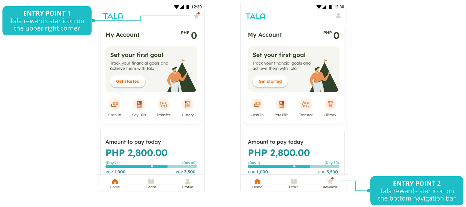
I tried two different entry points for the feature for user testing. The first entry point is in the bottom navigation and the second entry point is at the top of the screen, across from the Tala logo. I wanted to know if one entry point was more noticeable than the other.
Introduction screen
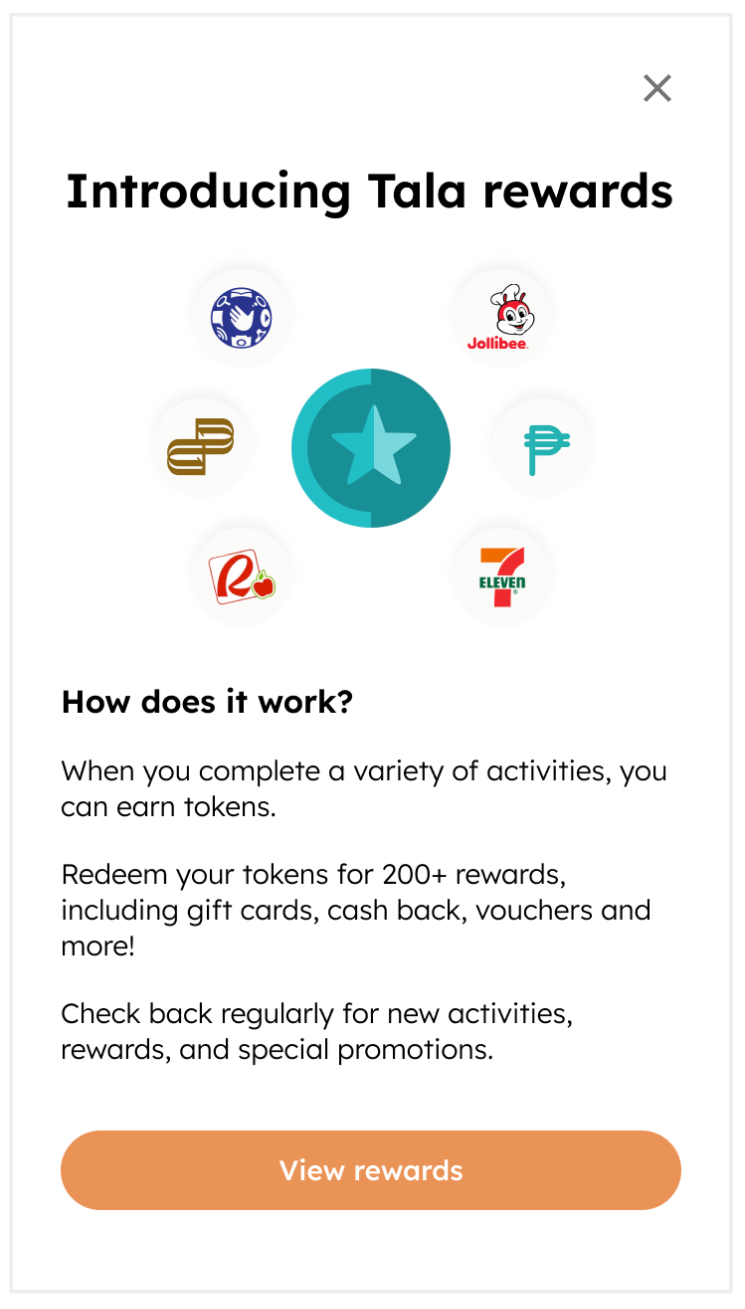
I added an introduction screen before the user enters the rewards homepage. I wanted to use the opportunity to explain what exactly Tala rewards and how it would be beneficial for the user.
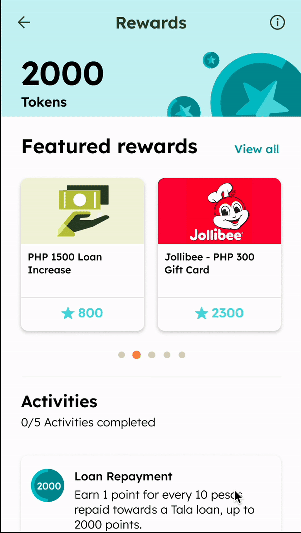
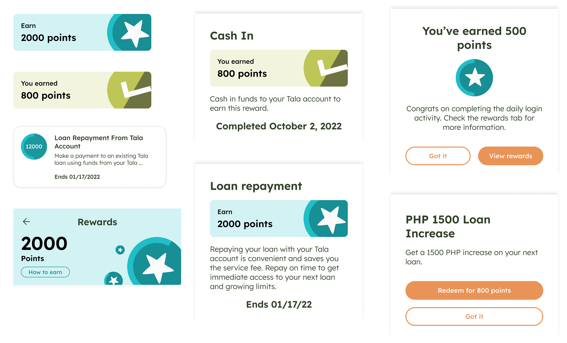
Rewards home screen

At the top of the page is the total amount of tokens that a user has. I made it a bright color with added illustrations and made it stick to the stop of the screen in order for it to be the focal point of the screen.
The featured rewards carousel gives a hint of the reward possibilities available for the user. If the user would like to see all the reward options, they can select the “View all” button.
The activities section shows all the possible activities that the user can complete and how many tokens they can earn.
How to earn information icon

The "how to earn" information is nested within the information icon. I decided to go this route instead of displaying that information openly on the homepage because the introduction screen already goes into depth about what Tala rewards are and how to earn. This information icon is meant as a reminder if someone happens to skip over the introduction screen.
Reward details

When a user selects one of the reward cards, they will see a bottom sheet detailing more information about the reward. If the user has enough tokens in their balance to redeem the reward, there will be a CTA button prompting them to to redeem the reward. If the user doesn’t have enough tokens, they will see a disabled button letting the user know that they need additional tokens to redeem the reward.
Featured rewards

If the user wants to see all the rewards available at the time, they can select the “View all” button and be taken to a new page where all the rewards are listed.
Activity details
When a user selects an activity card, they will see a bottom sheeting which contains more details about the activity including the time an activity needs to be completed by.
Redeeming rewards

When a user redeems a reward, they’ll see a bottom sheet detailing instructions on how to use the reward.
Completed activity
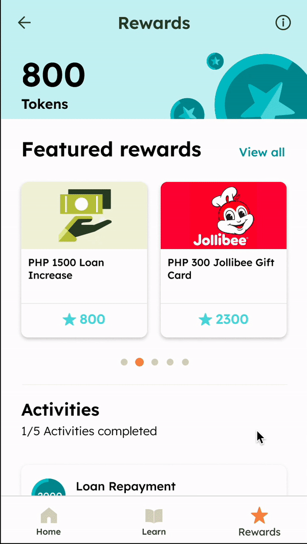
When a user completes an activity, they will see that the activity has been completed on the rewards home page.
User testing
Hypothesis that were tested:
1. Users know how to earn tokens and redeem rewards in our rewards program
• How do users perceive Tala’s rewards program?
• Do users know how to earn tokens and redeem rewards using their tokens?
• Do users understand how token/ point balance relate to their task and available rewards?
2. Users are motivated and compelled to do desired behavior in the Tala app to earn tokens and redeem rewards
• Do users find the rewards/ incentives enticing or motivating?
• How do users perceive the level of ease/ difficulty of earning tokens?
• What value do users find in Tala’s rewards program?
Methodology:
Moderated usability test
Best methodology to determine overall comprehension Tala rewards and to surface any potential issues with our product design.
User segments
We talked to a total of 14 users with activated Tala account and further segmented by # of loans disbursed:
Mature borrowers (n=7 users)
• Users that borrowed 10+ loans.
• Representation of users who have and have not transacted with Tala account.
Casual borrowers (n=7 users)
• Users that have borrowed 1-3 loans.
• Representation of users who have and have not transacted with Tala account.
Hypothesis #1
Users know how to earn tokens and redeem rewards in our rewards program.
VALIDATED ✅ No major comprehension issues were observed across segments. Only minor changes in messaging and design were needed.
• Users easily understood that each activity has a corresponding token amount they can earn once completed (e.g. cash in = 800 tokens)
• Users easily identified rewards that they can and cannot redeem yet with their total tokens earned.
• Users understood that by redeeming rewards, their total tokens earned will decrease.
• Need more clarity on the mechanics on earning tokens and redeeming rewards, specifically:
- Is there a minimum amount for cash in & bill pay to earn tokens
- Does the amount of token earned change depending on the amount of cash in / bill pay?
- Do users earn tokens every time they cash in/ bill pay?
- Can rewards be redeemed multiple times?
Hypothesis #2
Users are motivated and compelled to do desired behavior in the Tala app to earn tokens and redeem rewards.
VALIDATED ✅ There are indications of cash & bill pay trial, and early loan repayment to get benefits from Tala Rewards.
• Users who have not done any transactions in the Tala app: The Tala rewards program will likely drive trials of cash-in, bill pay, and loan repayment in the Tala account.
• Users who have done at least one transaction in the Tala app: Tala rewards likely to increase cash in and early repayment
• Overall, the list of rewards users can redeem is relevant and compelling. Tala-specific rewards and relevant vouchers (Jollibee, supermarkets, drugstores) drive motivation to complete activities and earn tokens.
Design changes based on user testing results
I worked with the brand design team and systems designer to update the designs to comply with the new design system that was being finalized.
I changed the currency name from tokens to points because users are used to seeing that term being used in other applications based on the feedback I got from the user testing.
Success Metrics Results
• 7% increase in early customer retention
• 11% decrease in loan default rates
• 14% increase in new Tala account deposits within 30 days
Conclusion - what I learned from this project
Navigating ambiguity. I was not previously familiar with the loyalty apps in the Philippines so I had to spend time learning about the market and the users. I worked closely with the researcher based out of the Philippines to help get myself the information I needed to be successful with the project.
Contributing to the design system. I spent a lot of time getting familiar with the Tala design system and worked very closely with the brand team and system designer to contribute to the system which was still a work in progress.